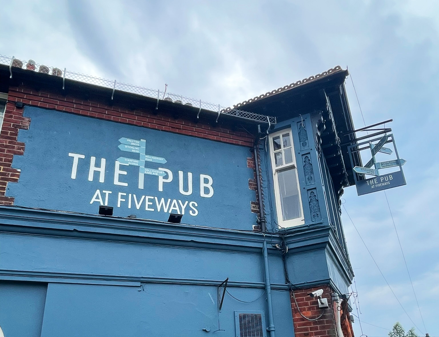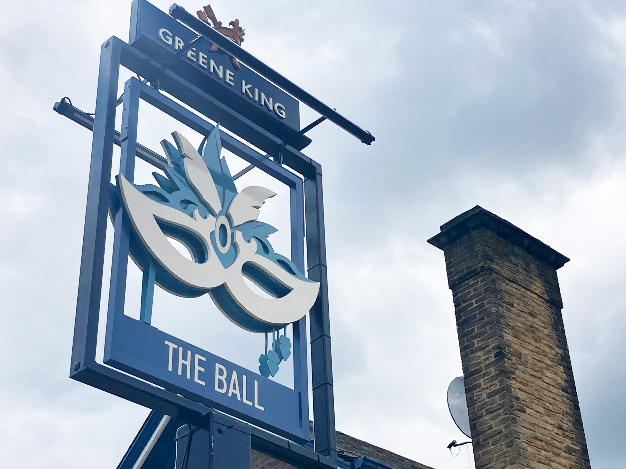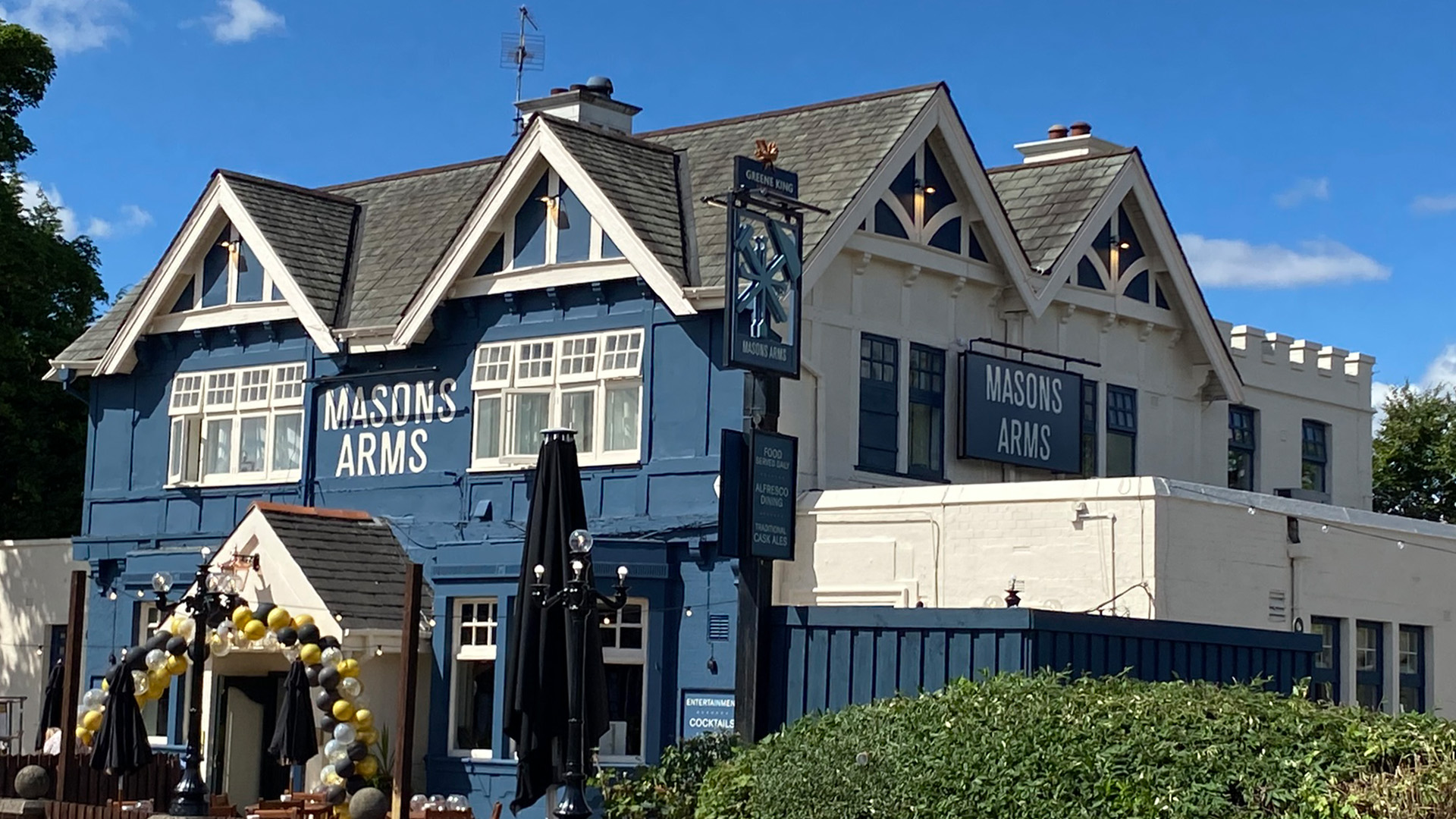
In university towns and cities there can often be a divide amongst pub patrons; in particular, locals and students. For Greene King, this was a key consideration for a number of pubs in their estate operating out of more affluent areas.
They knew that their visual presence needed to be right to effectively target a varied audience in these locations. With a robust relationship under our belt and experience aplenty, the Ashleigh team were well-placed to provide a suite of pub signs for this emerging brand.
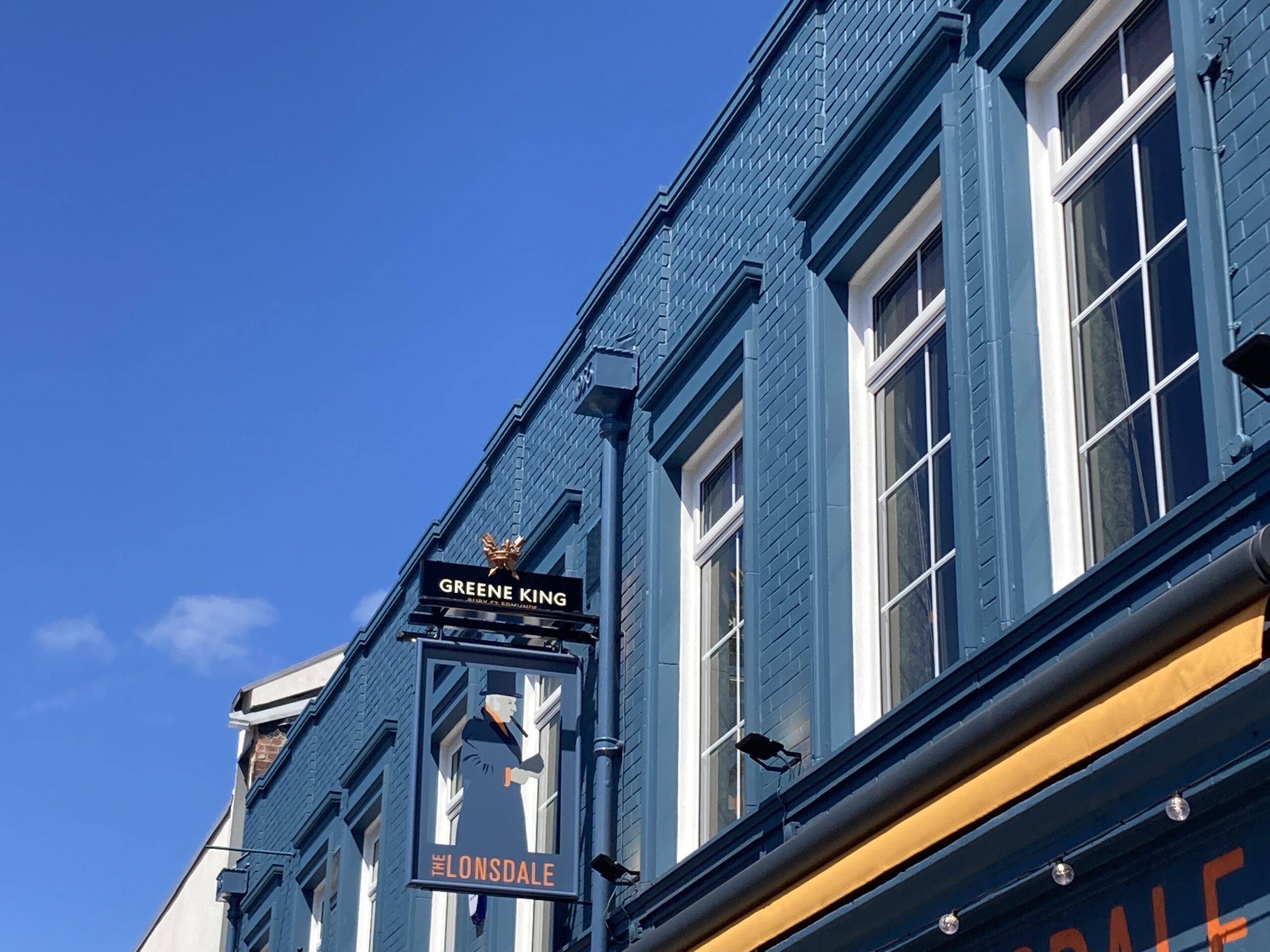
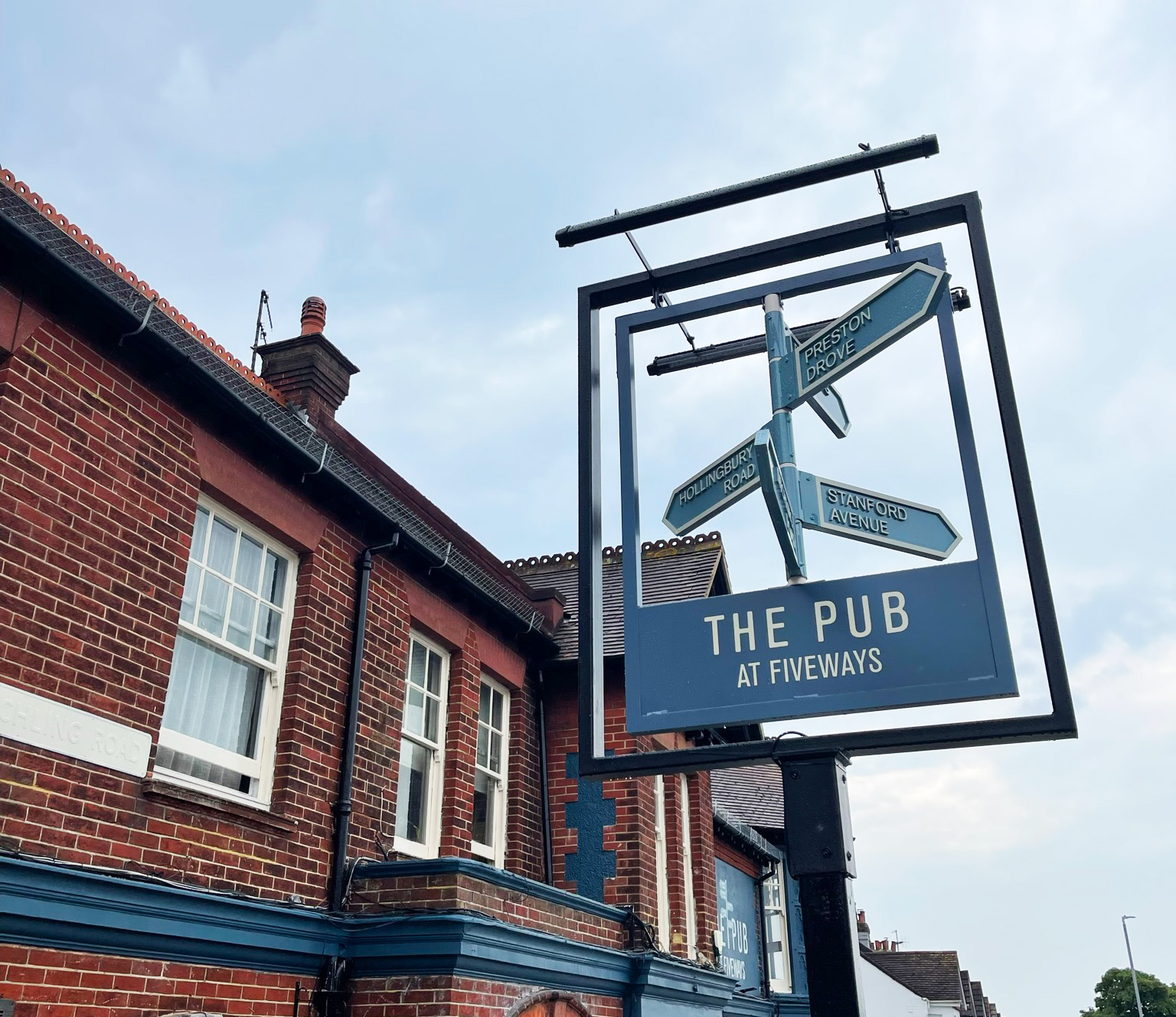
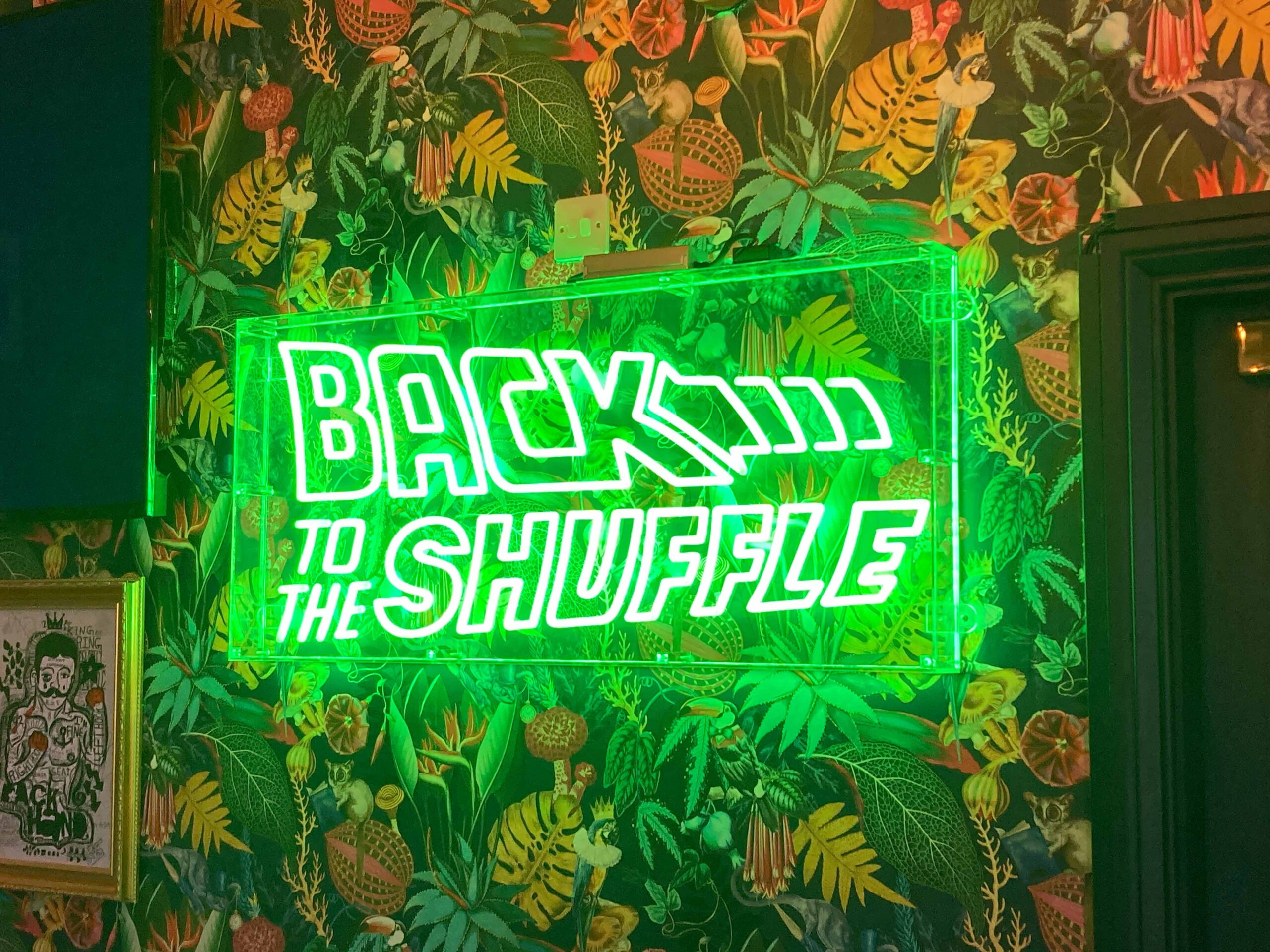
We followed guidelines to the nth degree to make sure local patrons felt at home in these venues, comforted by the Greene King brand elements they know and love.
We then capitalised on bolder styles for elements such as house names, incorporating statement signage to really capture the attention of a younger demographic. This encompassed large pictorials and even a faux neon element used at one site.
Signwriting was also a key feature of this project – both internally and externally – accentuating a more artsy vibe that would gain a cultured audience’s attention. This served to compliment the contemporary style of the interior design for a cohesive, premium feel.
